9/2/2026 - 25/2/2026 (Week 1 - Week 4)
Nadhrah binti Abdul Razak / 0359620
Design Principles / Bachelors of Design (Hons) in Creative Media
Project 1 - Exploration
.jpg)
INSTRUCTIONS

Nadhrah binti Abdul Razak / 0359620
Design Principles / Bachelors of Design (Hons) in Creative Media
Project 1 - Exploration
INSTRUCTIONS
DESIGN PRINCIPLES
1. Gestalt Theory- "Gestalt" refers to shape or form in German.
- Gestalt principles or laws are rules that describe how the human eye perceive visual elements.
- Gestalt principles or laws are rules that describe how the human eye perceive visual elements.
- These principles aim to show the complexity scenes can be reduced to more simple shapes.
- Aim to explain how the eyes perceive the shapes as a single, united form.
1a. Principle of Similarity
- Complete picture, shape, or group are perceived as similar elements even if they are separated.
- The brain seems to craft a link between elements of similar nature.
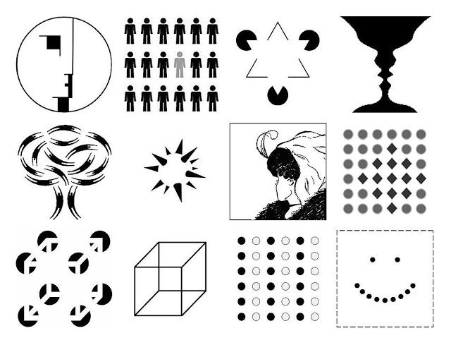
Fig 1.1a, Picture Reference
 Fig 1.1b, Picture Reference
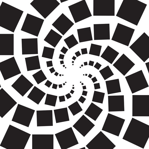
Fig 1.2b, Picture Reference
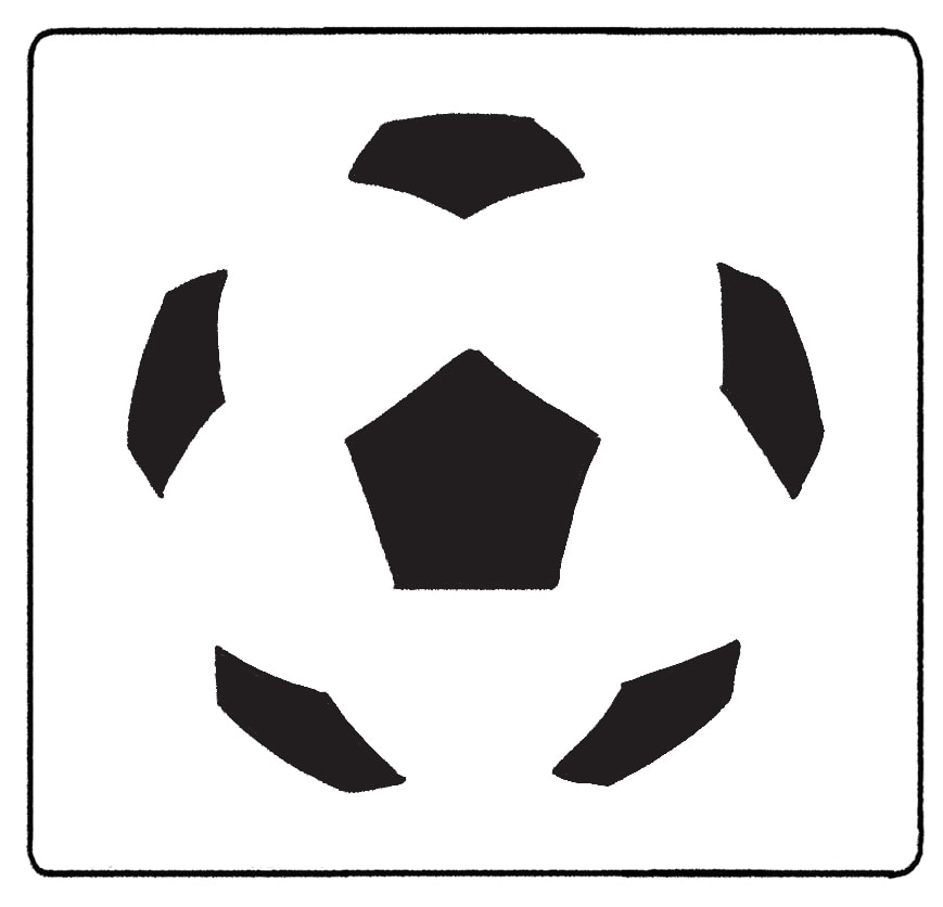
Fig 1.3c, Picture Reference
.png)
Fig 1.2d

Fig 1.2e, Picture Reference
- Aim to explain how the eyes perceive the shapes as a single, united form.
1a. Principle of Similarity
- Complete picture, shape, or group are perceived as similar elements even if they are separated.
- The brain seems to craft a link between elements of similar nature.
Fig 1.1a, Picture Reference
1b. Principle of Continuation
- The human eye follows the paths, lines, and curves of a design
- Prefers to see a continuous flow of visual elements rather than separated objects.
- The human eye follows the paths, lines, and curves of a design
- Prefers to see a continuous flow of visual elements rather than separated objects.
Fig 1.2b, Picture Reference
1c. Principle of Closure
- The human eye prefers to see complete shapes. If the visual elements are not complete, the user can perceive a complete shape by filling in missing visual information.
- The human eye prefers to see complete shapes. If the visual elements are not complete, the user can perceive a complete shape by filling in missing visual information.


Fig 1.3c, Picture Reference
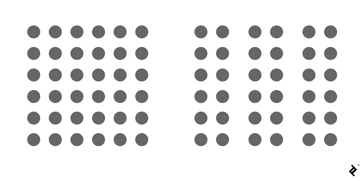
1d. Principle of Proximity
- The process of ensuring related design elements are placed together. Any unrelated items, should be spaced apart.
- Close proximity indicates items that are connected or have a relationship to each other and become one visual unit which helps organise or give structure to a layout.
- The process of ensuring related design elements are placed together. Any unrelated items, should be spaced apart.
- Close proximity indicates items that are connected or have a relationship to each other and become one visual unit which helps organise or give structure to a layout.
.png)
Fig 1.2d
1e. Principle of Figure/Ground
- Objects are perceived as being either in the foreground or the background.
- Stand out either prominently in the front (the figure) or recede into the back (the ground).
- Objects are perceived as being either in the foreground or the background.
- Stand out either prominently in the front (the figure) or recede into the back (the ground).

Fig 1.2e, Picture Reference
1f. Law of Symmetry & Order
- Elements that are symmetrical to each other tend to be perceived as a unified group.
- Suggests that objects that are symmetrical with each other will be more likely to be grouped together.
- Elements that are symmetrical to each other tend to be perceived as a unified group.
- Suggests that objects that are symmetrical with each other will be more likely to be grouped together.
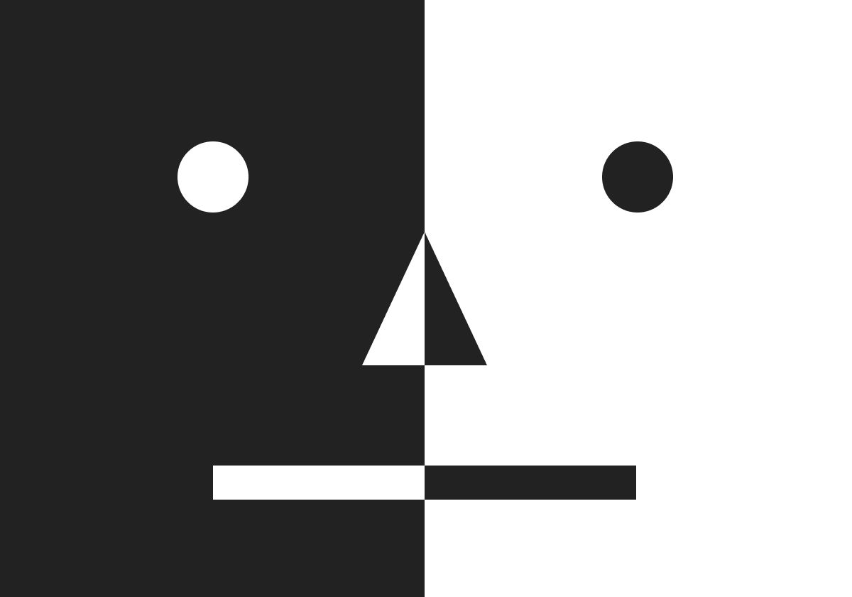

2. Contrast
- The juxtaposition of strongly dissimilar elements.
- Contrast can provide visual interest, emphasize a point as well as express content.
- Contrast can provide visual interest, emphasize a point as well as express content.
Fig 2.1, Picture Reference


3. Emphasis
- Used to create dominance and focus in a design work.
- Elements that can be used to achieve dominance: colour, shapes or value.
- Elements that can be used to achieve dominance: colour, shapes or value.


4. Balance
- Refers to the distribution of visual weight in a work of design.
- The visual equilibrium of the elements that causes the total image to appear balanced.
- Balance can be symmetrical or asymmetrical.
4a. Symmetrical Balance
- Has equal weight on equal sides of a centrally place fulcrum.
- Equal arrangement of elements on either side of the central axis resulting in bilateral balance.
- Arranging elements equally around a central point results in radial balance.
- Approximate symmetry is when equivalent but not identical forms are arranged around the fulcrum line.

Fig 4.1a, Picture Reference
 Fig 4.3a, Picture Reference
4a. Symmetrical Balance
- Has equal weight on equal sides of a centrally place fulcrum.
- Equal arrangement of elements on either side of the central axis resulting in bilateral balance.
- Arranging elements equally around a central point results in radial balance.
- Approximate symmetry is when equivalent but not identical forms are arranged around the fulcrum line.
Fig 4.1a, Picture Reference

4b. Asymmetrical Balance
- Unequal visual weight on each side of the composition
- One side of the composition might contain a dominant element, which could be balanced by a couple or more lesser focal points on the other side
- More dynamically interesting; Evokes a feeling of modernism, movement, energy and vitality
- Offers more visual variety, although it can be difficult to achieve because the relationships between elements are more complex.


5. Repetition
- Could make a work of design seem active.
- The repetition of elements of design creates rhythm and pattern within the work.
- Variety* is essential to keep rhythms exciting and active, and to avoid monotony.
- Pattern increases visual excitement by enriching surface interest.
- Variety* is essential to keep rhythms exciting and active, and to avoid monotony.
- Pattern increases visual excitement by enriching surface interest.


6. Movement
- The way a design leads the eye in, around, and through a composition; the path that the eye follows
- Motion or movement in a visual image occurs when object seems to be moving in a visual image
- Movement in a visual image comes from the kinds of shapes, form, lines and curves that are used.


7. Harmony & Unity
- Involves the selection of elements that share a common trait.
- Becomes monotony without variety*.
- The sense that all of the elements in the design fit together (theme, aesthetic style or mood).
- The repetition of particular elements throughout a design; colors, shapes or materials; to pull the look together.
- Occurs when elements are composed in a balanced and give sense of oneness, creating a theme.


8. Symbol
- A sign, shape or object that is used to represent something else.
- In design, symbols can provide or convey information, equivalent to one or more sentences of text, or even a whole story.
8a. Pictorial symbols
- Image-related and simplified pictures.

Fig 8.1a, Picture Reference
8a. Pictorial symbols
- Image-related and simplified pictures.
Fig 8.1a, Picture Reference
8b. Abstract symbols
- Can look like the objects that they represent but have less details.


9. Word and Image
- Image is a vital part of design, be it print or digital; it is important to use suitable and relevant images.
- Suitable typeface and strategic positioning of the type will help visual hierarchy and balance.
- Typography is the design and arrangement of text to convey a message or concept.


Title of Design: Brain Dump
Designer's Name: Unga
Year: 2024
Size: 45x61cm
Medium: 7 colors silk screen print
Summary:
I have chosen this poster as my choice of interest because I think it represents unconventionality and uniqueness. Though the artwork was designed for a band gig called "Pearl Jam", it does not feel like a typical band poster. The designer incorporated the use of bold graphic illustrations. For example, the head illustration with an exposed brain and a pipe coming out of the mouth. I think this artwork emphasizes the idea of "harmful speech" in a symbolic way. The brain taking a dump which directly leads to the mouth suggests that sometimes the brain's worst thoughts will inevitably blurt out of one's mouth. With this design, I find it powerful because it is able to convey a deep meaningful message without doing too much. In my opinion, it is very creative and well thought out. The simplicity of this design makes it memorable yet not boring. I like how it is minimalistic, has a clean layout and is clearly dominated by just one element, which is the head. Overall, the design is visually pleasing, well thought out, unconventional yet has a strong message to it. (186 words)
Design Principles:
- Contrast
- Emphasis
- Symbol
- Movement
- Gestalt
Feedbacks
Week 1:
- No class
Week 2:
- General Feedback: Include reference pictures for the design principles, and choose an artwork that you like.
- Personal Feedback: The structure of the blog is okay so far.
Week 3:
- Public Holiday
Week 4:
- Personal Feedback: Choice of initial artwork might not fit the assignment as it's too abstract. Choose something that correlates more to the references you used for the lecture.
- No class
Week 2:
- General Feedback: Include reference pictures for the design principles, and choose an artwork that you like.
- Personal Feedback: The structure of the blog is okay so far.
Week 3:
- Public Holiday
- Personal Feedback: Choice of initial artwork might not fit the assignment as it's too abstract. Choose something that correlates more to the references you used for the lecture.
Comments
Post a Comment