Design Principles - Project 1: Exploration
6/2/2024 - (Week 1 - Week)
Nadhrah binti Abdul Razak / 0359620
Design Principles / Bachelors of Design (Hons) in Creative Media
Project 1: Exploration
INSTRUCTIONS
Design Principles
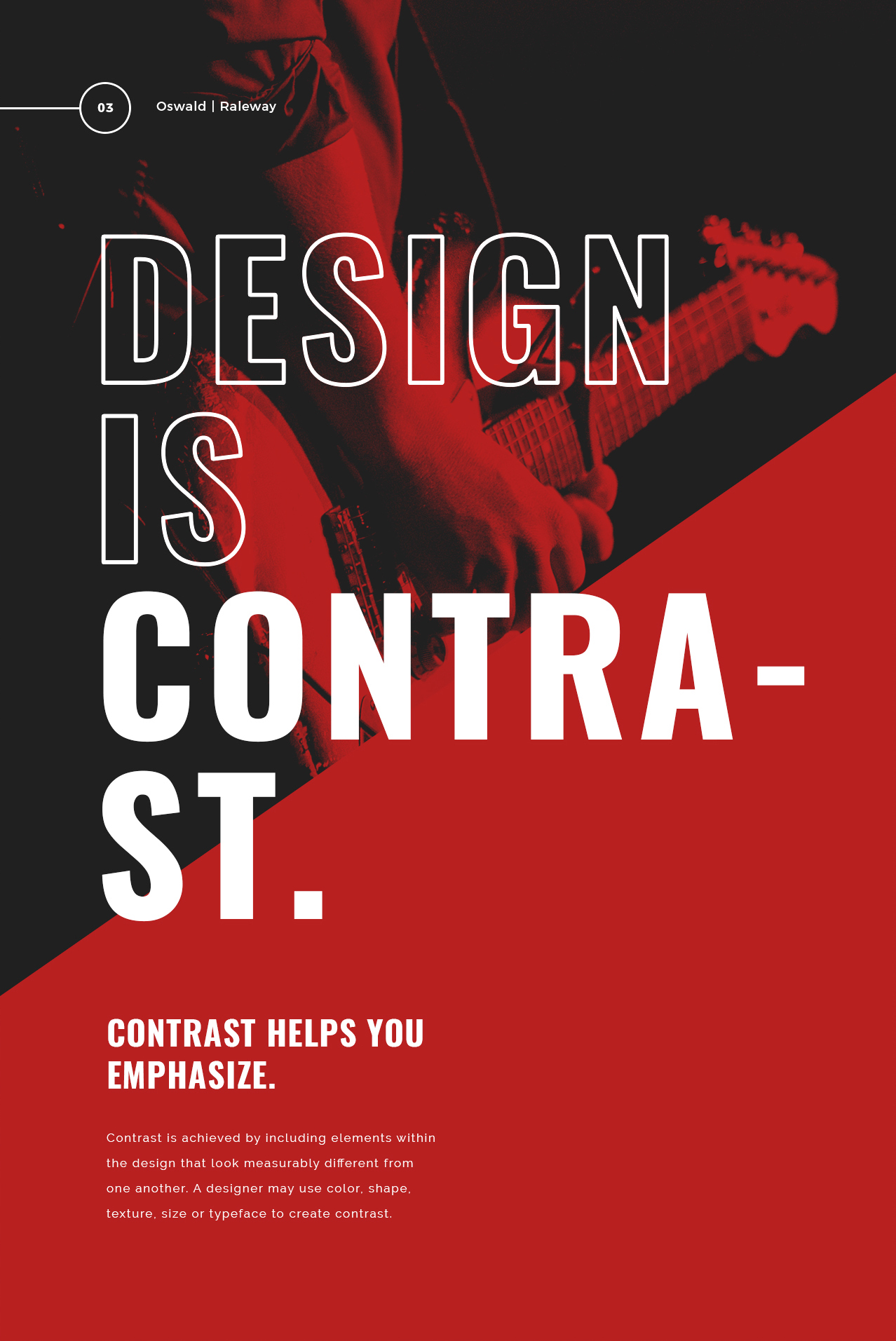
1. Contrast
- The juxtaposition of strongly dissimilar elements.
- Contrast can provide visual interest, emphasize a point as well as express content.

Fig 1.1, Picture Reference
2. Gestalt Theory
- "Gestalt" refers to shape or form in German.
- Gestalt principles or laws are rules that describe how the human eye perceive visual elements.
- These principles aim to show the complexity scenes can be reduced to more simple shapes.
- Aim to explain how the eyes perceive the shapes as a single, united form.
2a. Principle of Similarity
- Complete picture, shape, or group are perceived as similar elements even if they are separated.
- The brain seems to craft a link between elements of similar nature.
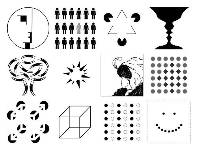
Fig 2.1a, Picture Reference
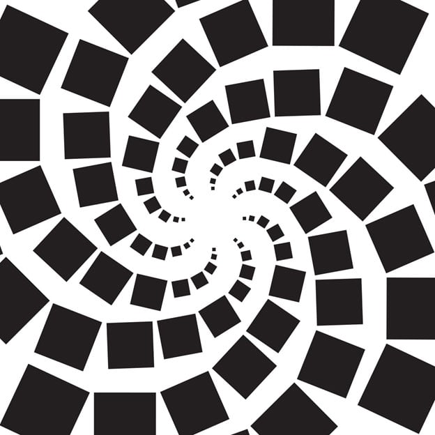
Fig 2.2b, Picture Reference
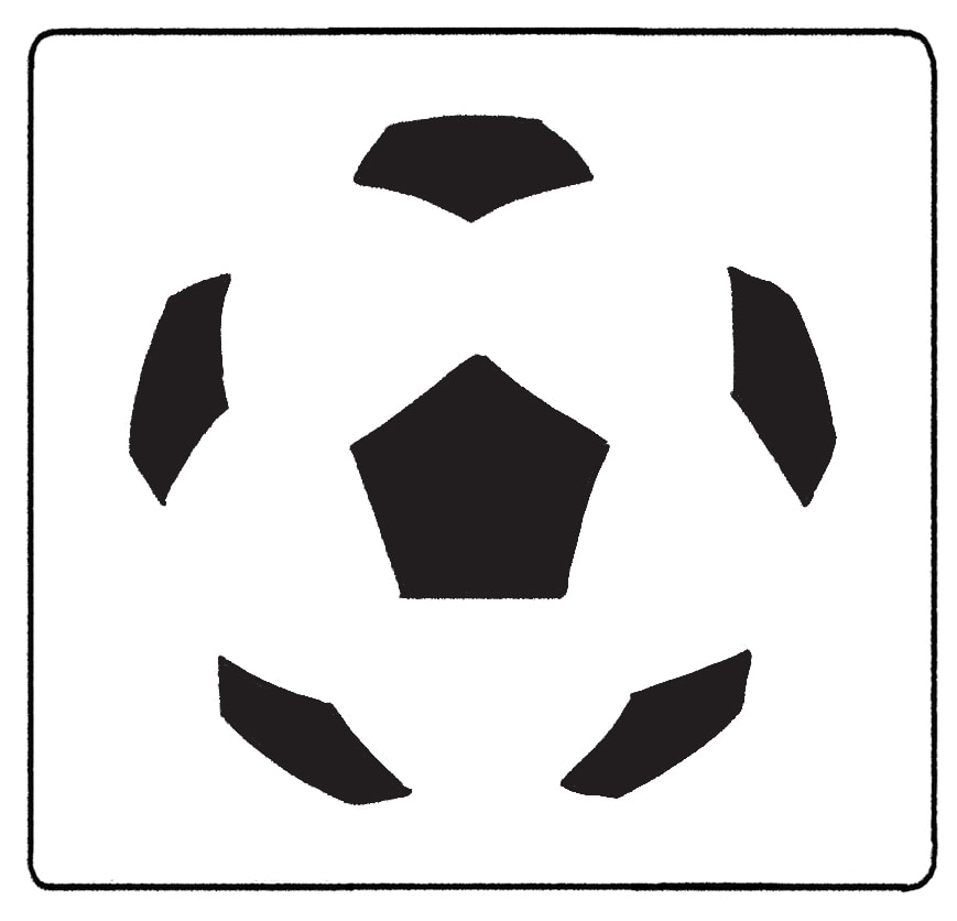
Fig 2.3c, Picture Reference
.png)
Fig 2.2d

Fig 2.2e, Picture Reference
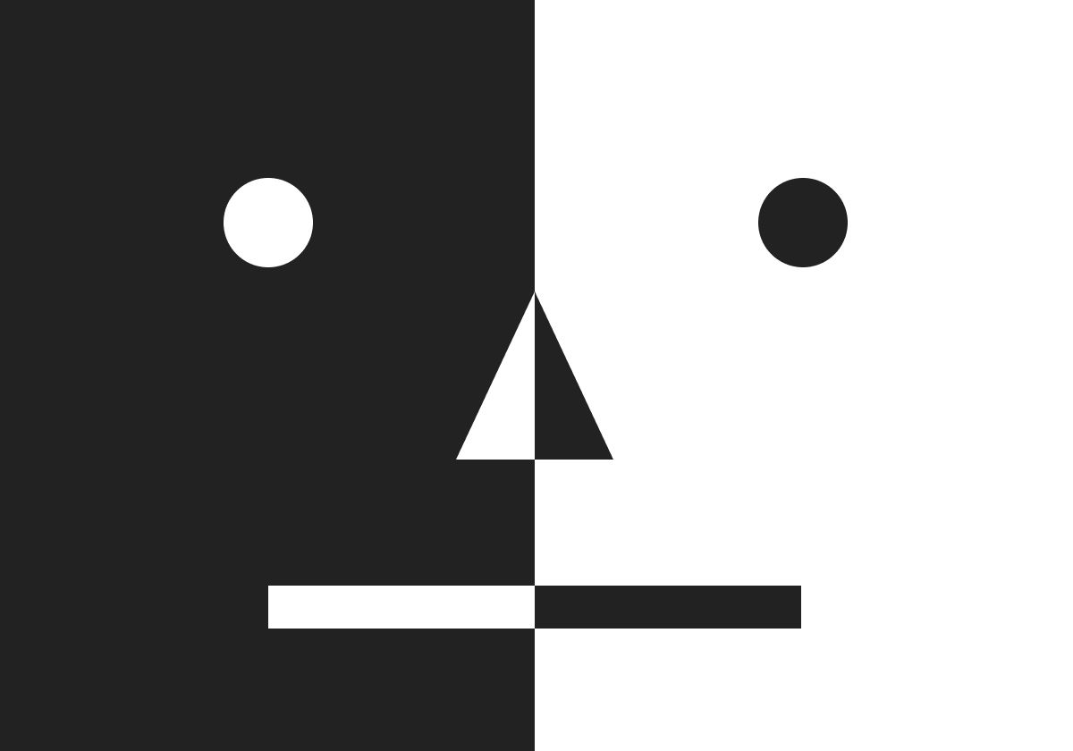
Fig 2.1f, Picture Reference

Fig 2.2f, Picture Reference

Fig 2.3f, Picture Reference
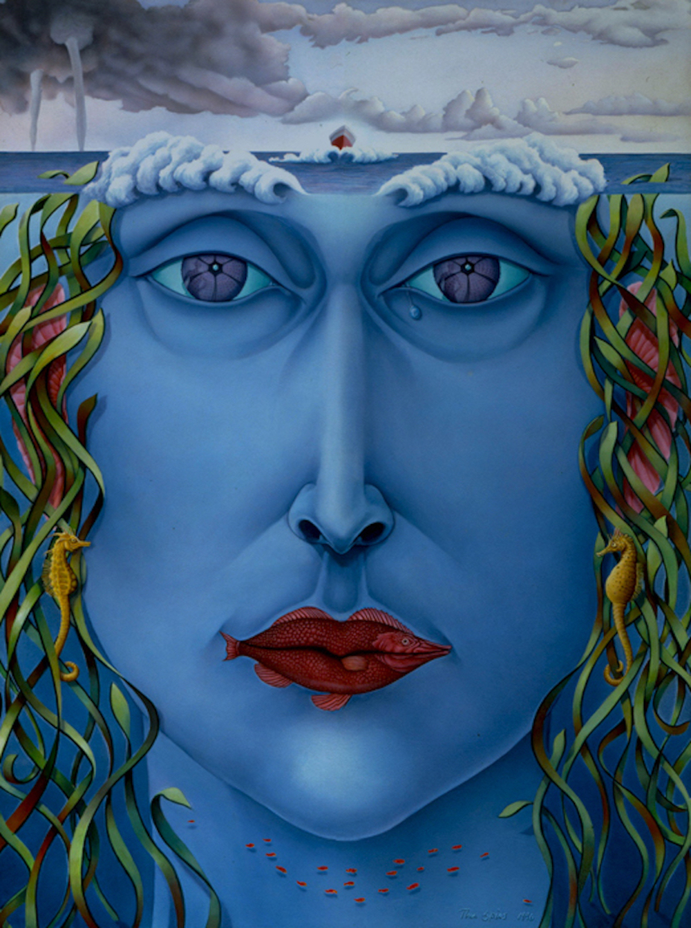
Title of Artwork: Yamima
Artist's Name: Tina Spiro
Year: 1996
Size: 54' x 36'
Medium: Oil and Casein on canvas
Source Link
- Aim to explain how the eyes perceive the shapes as a single, united form.
2a. Principle of Similarity
- Complete picture, shape, or group are perceived as similar elements even if they are separated.
- The brain seems to craft a link between elements of similar nature.

Fig 2.1a, Picture Reference
2b. Principle of Continuation
- The human eye follows the paths, lines, and curves of a design
- Prefers to see a continuous flow of visual elements rather than separated objects.
- The human eye follows the paths, lines, and curves of a design
- Prefers to see a continuous flow of visual elements rather than separated objects.

Fig 2.2b, Picture Reference
2c. Principle of Closure
- The human eye prefers to see complete shapes. If the visual elements are not complete, the user can perceive a complete shape by filling in missing visual information.
- The human eye prefers to see complete shapes. If the visual elements are not complete, the user can perceive a complete shape by filling in missing visual information.

Fig 2.3c, Picture Reference
2d. Principle of Proximity
- The process of ensuring related design elements are placed together. Any unrelated items, should be spaced apart.
- Close proximity indicates items that are connected or have a relationship to each other and become one visual unit which helps organise or give structure to a layout.
- The process of ensuring related design elements are placed together. Any unrelated items, should be spaced apart.
- Close proximity indicates items that are connected or have a relationship to each other and become one visual unit which helps organise or give structure to a layout.
.png)
Fig 2.2d
2e. Principle of Figure/Ground
- Objects are perceived as being either in the foreground or the background.
- Stand out either prominently in the front (the figure) or recede into the back (the ground).
- Objects are perceived as being either in the foreground or the background.
- Stand out either prominently in the front (the figure) or recede into the back (the ground).

Fig 2.2e, Picture Reference
2f. Law of Symmetry & Order
- Elements that are symmetrical to each other tend to be perceived as a unified group.
- Suggests that objects that are symmetrical with each other will be more likely to be grouped together.
- Elements that are symmetrical to each other tend to be perceived as a unified group.
- Suggests that objects that are symmetrical with each other will be more likely to be grouped together.

Fig 2.1f, Picture Reference

Fig 2.2f, Picture Reference

Fig 2.3f, Picture Reference
3. Balance
- Refers to the distribution of visual weight in a work of design.
- The visual equilibrium of the elements that causes the total image to appear balanced.
- Refers to the distribution of visual weight in a work of design.
- The visual equilibrium of the elements that causes the total image to appear balanced.
- Balance can be symmetrical or asymmetrical.
3a. Symmetrical Balance
- Has equal weight on equal sides of a centrally place fulcrum.
- Equal arrangement of elements on either side of the central axis resulting in bilateral balance.
- Arranging elements equally around a central point results in radial balance.
- Approximate symmetry is when equivalent but not identical forms are arranged around the fulcrum line.

Fig 3.1a, Picture Reference

Fig 3.2a, Picture Reference

Fig 3.3a, Picture Reference
3a. Symmetrical Balance
- Has equal weight on equal sides of a centrally place fulcrum.
- Equal arrangement of elements on either side of the central axis resulting in bilateral balance.
- Arranging elements equally around a central point results in radial balance.
- Approximate symmetry is when equivalent but not identical forms are arranged around the fulcrum line.

Fig 3.1a, Picture Reference

Fig 3.2a, Picture Reference

Fig 3.3a, Picture Reference
3b. Asymmetrical Balance
- Unequal visual weight on each side of the composition
- One side of the composition might contain a dominant element, which could be balanced by a couple or more lesser focal points on the other side
- More dynamically interesting; Evokes a feeling of modernism, movement, energy and vitality
- Offers more visual variety, although it can be difficult to achieve because the relationships between elements are more complex.

Fig 3.1b, Picture Reference

Fig 3.2b, Picture Reference

Fig 4.2, Picture Reference
- Unequal visual weight on each side of the composition
- One side of the composition might contain a dominant element, which could be balanced by a couple or more lesser focal points on the other side
- More dynamically interesting; Evokes a feeling of modernism, movement, energy and vitality
- Offers more visual variety, although it can be difficult to achieve because the relationships between elements are more complex.

Fig 3.1b, Picture Reference

Fig 3.2b, Picture Reference
4. Emphasis
- Used to create dominance and focus in a design work.
- Elements that can be used to achieve dominance: colour, shapes or value
- Used to create dominance and focus in a design work.
- Elements that can be used to achieve dominance: colour, shapes or value
Fig 4.1, Picture Reference
Fig 4.2, Picture Reference
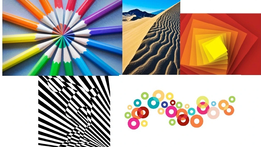
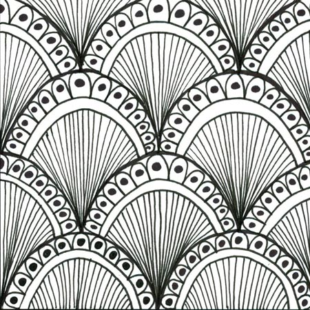
5. Repetition - Pattern & Rhythm
- Could make a work of design seem active
- Could make a work of design seem active
- The repetition of elements of design creates rhythm and pattern within the work.
- Variety* is essential to keep rhythms exciting and active, and to avoid monotony.
- Pattern increases visual excitement by enriching surface interest.

Fig 5.3, Picture Reference
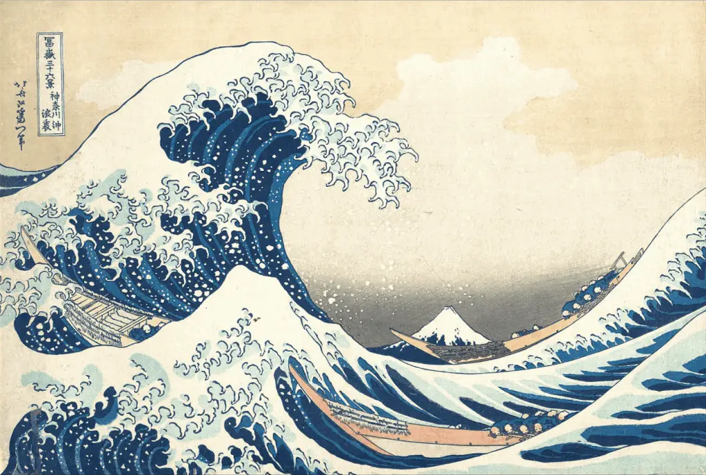
Fig 6.1, Picture Reference

Fig 6.2, Picture Reference
 |
|
Fig 6.3, Picture Reference
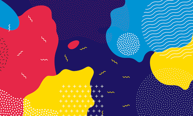
7. Harmony
- Involves the selection of elements that share a common trait
- Becomes monotony without variety*
- The sense that all of the elements in the design fit together (theme, aesthetic style or mood)

Fig 7.1, Picture Reference

Fig 7.3, Picture Reference
8. Unity
- The repetition of particular elements throughout a design; colors, shapes or materials; to pull the look together.
- Occurs when elements are composed in a balanced and give sense of oneness, creating a theme

Fig 8.1, Picture Reference

Fig 8.2, Picture Reference
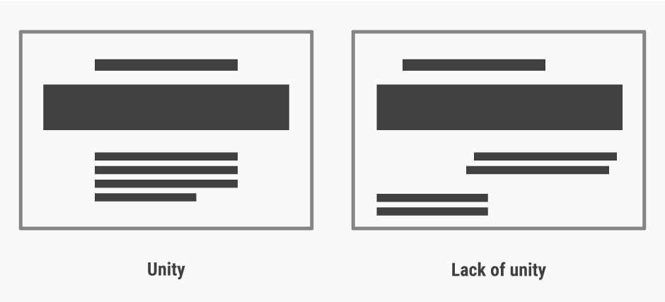
Fig 8.3, Picture Reference
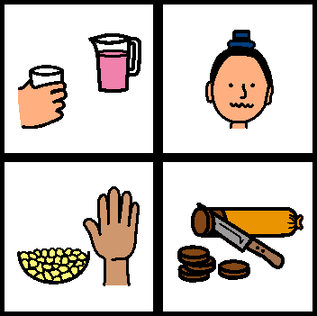
9. Symbol
- A sign, shape or object that is used to represent something else
- In design, symbols can provide or convey information, equivalent to one or more sentences of text, or even a whole story
9a. Pictorial symbols; image-related and simplified pictures

Fig 9.1a, Picture Reference

Fig 9.1b, Picture Reference
Fig 9.3b, Picture Reference
10. Word & Image
- Image is a vital part of design, be it print or digital; it is important to use suitable and relevant images
- Suitable typeface and strategic positioning of the type will help visual hierarchy and balance
- Typography is the design and arrangement of text to convey a message or concept
- Variety* is essential to keep rhythms exciting and active, and to avoid monotony.
- Pattern increases visual excitement by enriching surface interest.

Fig 5.3, Picture Reference
6. Movement
- The way a design leads the eye in, around, and through a composition; the path that the eye follows
- Motion or movement in a visual image occurs when object seems to be moving in a visual image
- Movement in a visual image comes from the kinds of shapes, form, lines and curves that are used.
- The way a design leads the eye in, around, and through a composition; the path that the eye follows
- Motion or movement in a visual image occurs when object seems to be moving in a visual image
- Movement in a visual image comes from the kinds of shapes, form, lines and curves that are used.

Fig 6.1, Picture Reference

Fig 6.2, Picture Reference
 |
|Fig 6.3, Picture Reference
7. Harmony
- Involves the selection of elements that share a common trait
- Becomes monotony without variety*
- The sense that all of the elements in the design fit together (theme, aesthetic style or mood)

Fig 7.1, Picture Reference

Fig 7.3, Picture Reference
8. Unity
- The repetition of particular elements throughout a design; colors, shapes or materials; to pull the look together.
- Occurs when elements are composed in a balanced and give sense of oneness, creating a theme

Fig 8.1, Picture Reference

Fig 8.2, Picture Reference

Fig 8.3, Picture Reference
9. Symbol
- A sign, shape or object that is used to represent something else
- In design, symbols can provide or convey information, equivalent to one or more sentences of text, or even a whole story
9a. Pictorial symbols; image-related and simplified pictures

Fig 9.1a, Picture Reference
9b. Abstract symbols
- can look like the objects that they represent but have less details
- can look like the objects that they represent but have less details

Fig 9.1b, Picture Reference

Fig 9.3b, Picture Reference
10. Word & Image
- Image is a vital part of design, be it print or digital; it is important to use suitable and relevant images
- Suitable typeface and strategic positioning of the type will help visual hierarchy and balance
- Typography is the design and arrangement of text to convey a message or concept
United Nations' Sustainable Development Goals (UNSDG) & Artwork- The goal that I have chosen from UNSDG is goal 13 - Climate Action.
Description of Goal 13: Climate Action
Description of Goal 13: Climate Action
- Climate action stands for "stepped-up efforts to reduce greenhouse gas emissions and strength resilience and adaptive capacity climate-induced impacts, including: improving education, awareness-raising as well as human and institutional capacity with respect to climate change mitigation, adaptation, impact reduction, and early warning.

Title of Artwork: Yamima
Artist's Name: Tina Spiro
Year: 1996
Size: 54' x 36'
Medium: Oil and Casein on canvas
Source Link
The artwork that I have chosen in relation to UNSDG's Climate Action is the Yamima painting by Tina Spiro. The reason I have chosen this artwork is because it shows an immense potential for driving climate change as it contains an emotive impact. The name Yamima is a combination of the words (in Hebrew) "sea" which is "yam" and "mother" as "ima". With this being the name of the artwork, it shows us how humans should protect the sea just like how mothers take care of their children. Furthermore, the artwork holds an inspiring and hopeful meaning behind it. While climate change can be daunting, Yamima conveys a powerful message that may encourage viewers to believe in the possibility of positive change and get them involved in climate action efforts. - 140 words.
Design Principles in the "Yamima" artwork:
- Symmetry
- Emphasis
- Movement
Feedback
Week 1: Some of the design principles does not fit the chosen artwork. Choose different design principles. As well as add links for the picture references.
Week 2: Shorten the picture references' links.
Reflection
Design Principles in the "Yamima" artwork:
- Symmetry
- Emphasis
- Movement
Feedback
Week 1: Some of the design principles does not fit the chosen artwork. Choose different design principles. As well as add links for the picture references.
Week 2: Shorten the picture references' links.
Reflection
As I've explored the world of design principles, I've come to realise that each artwork, signage, and poster holds its own unique design principles, waiting to be discovered. By immersing myself in various visual creations, I've gained a deeper understanding of these principles, seeing their beauty in new ways.
And then there's the United Nations Sustainable Development Goals (UNSDG), which has opened my eyes to the importance of protecting our planet and living sustainably. It's become clear that we all have a role to play in ensuring a better future for our world.
Further Readings: For my first further reading, I have chosen to read about A Comprehensive Guide on the Color Wheel for Artists, recommended by Dr Jinchi in her lecture slide.
As I was doing some further readings on Artist's Color Wheel (drawpaintacademy.com) , I have learnt that the article is about how artists use this special tool to understand colors better. Basically, it breaks down colors into primary, secondary, and tertiary ones, and it talks about how they all relate to each other. There's also stuff about complementary colors, which are like opposites on the color wheel, and how artists use them to make their paintings pop. Furthermore, the article dove into warm and cool colors too, and how they can totally change the mood of a painting. In my opinion, I feel like this article has helped me understand color theory and how to use it in my own artworks.







Comments
Post a Comment